Zephyr
HCI Independent Study
How might we empower
teachers with data?
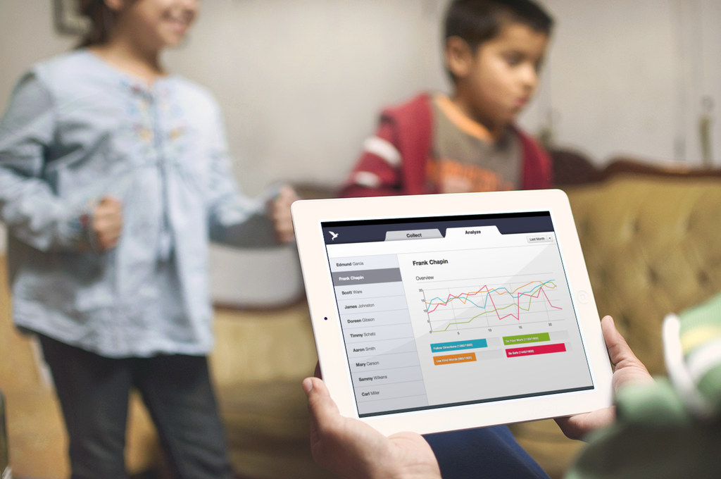
Working with local elementary schools, our team designed and developed an iPad app to help teachers track and analyze the behavior of their special education students.
The Problem
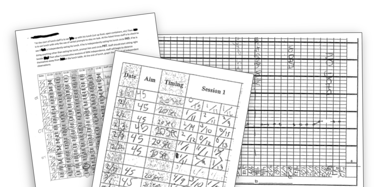
A paper driven workflow made it difficult for
teachers to collect and analyze data.
Data Collection Issues
Paper records and a distracting enviornment made it difficult for teachers to collect student data.
Manual Paper Records
Most data was collected manually on paper and stored away in cumbersome mobile cabinets.
Distracting Classroom Enviornment
Teaching staff were working in a busy enviornment, and weren't always able to record data immediately. Any time spent recording data was time not spent working with a child.
Tools designed for one student
Existing electronic tools weren't well suited for classroom enviornments. Most were designed to work for a single individual.
Analysis Challenges
Hand-plotted graphs made it difficult to explore data, yet easy to misinterpret.
Inconsistent Collection Methods
Different staff members working in different classrooms often used different ways to record data, making meaningful comparisons between student data difficult.
Parents often misinterpreted data
Parents oftentimes misunderstood data that was being sent home, to the point that one school intentionally stopped sending home daily data sheets.
Cumbersome Hand-Plotted Graphs
Analysis of multiple hand-plotted graphs really only occurred at monthly reviews, and even then could only be interpreted from a single, static perspective.
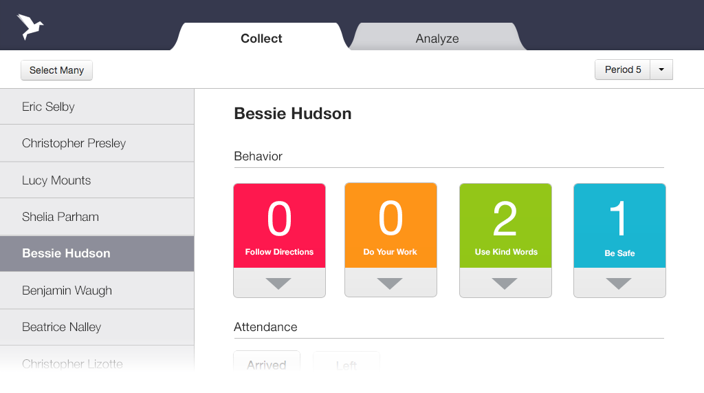
The Prototype
We designed and built an iPad app that
serves as a better alternative to paper forms.
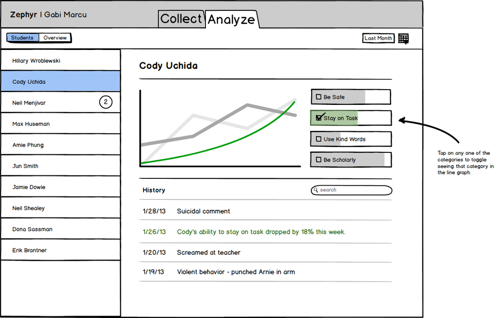
Multitouch Visualizations
I prototyped a more natural way to explore progress over time.
Staff periodically meet to discuss student data, and want to measure student progress across time. While typically they conducted a 20-day review, it was also important to be able to see progress across an entire year, and even drill down into a particular week.
I worked on making use of multitouch gestures to explore graphs over time, allowing zooming in/out and scrolling to move around graph, instead of introducing a separate control for adjusting time.
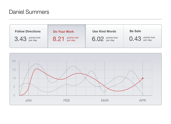
Automated Analysis
I wrote a tool that automatically notified teachers of trends in their data.
Instead of limiting staff to combing through data only during monthly reviews, we wanted to expose staff to data on an ongoing basis.
I developed an automated Python script that discovers and notifies staff of interesting features in student data, ranging from decline in performance to correlation between multiple students and factors (such as the day of week).
Challenges
Distracting Teachers
We had to be careful to not interrupt/distract staff with superfluous notifications.
Automation as a crutch
Automated systems can't notice everything. Instead of relying purely on automation, we wanted to encourage staff to regularly dive deeper into the data.
Misleading Absolutes
Correlation does not imply causation. Instead of showing staff absolute trends, we tried to suggest where staff should look first, and encourage them to explore and make decisions on their own.
I design and build interfaces, primarily for web and iOS.
In my spare time I also like to prototype new ways for people to interact with technology.
Get in touch - email me at ryhan@cmu.edu.
I`m currently a senior at Carnegie Mellon interested in the intersection between computer science and user interface design.
Previously I created interactive prototypes and wrote JavaScript at Apple, Google, and Metalab Design. I`m fond of CoffeeScript.