
Ulcer Assessment Tool
Designing Human Centered Software
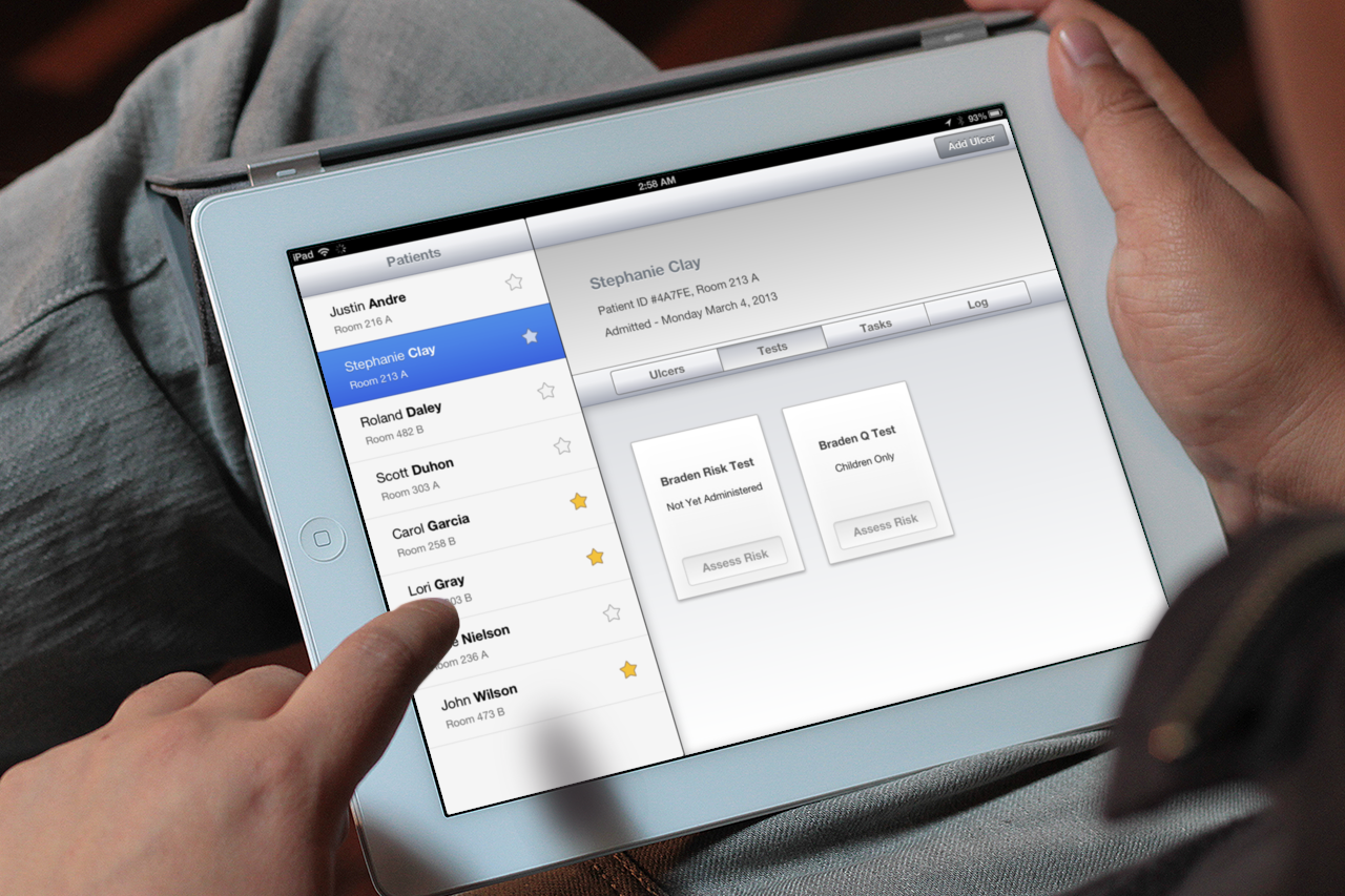
I created an iPad app to help nurses track, analyze, and treat clinical pressure ulcers.
As part of a course project, I led a 5 person team to research, design, and prototype a tool intended to be used in a clincial setting.
Our tool helps nurses collect data and photos of an ulcer over time, step through existing tests, keep track of repeated treatments, and analyze everything later.
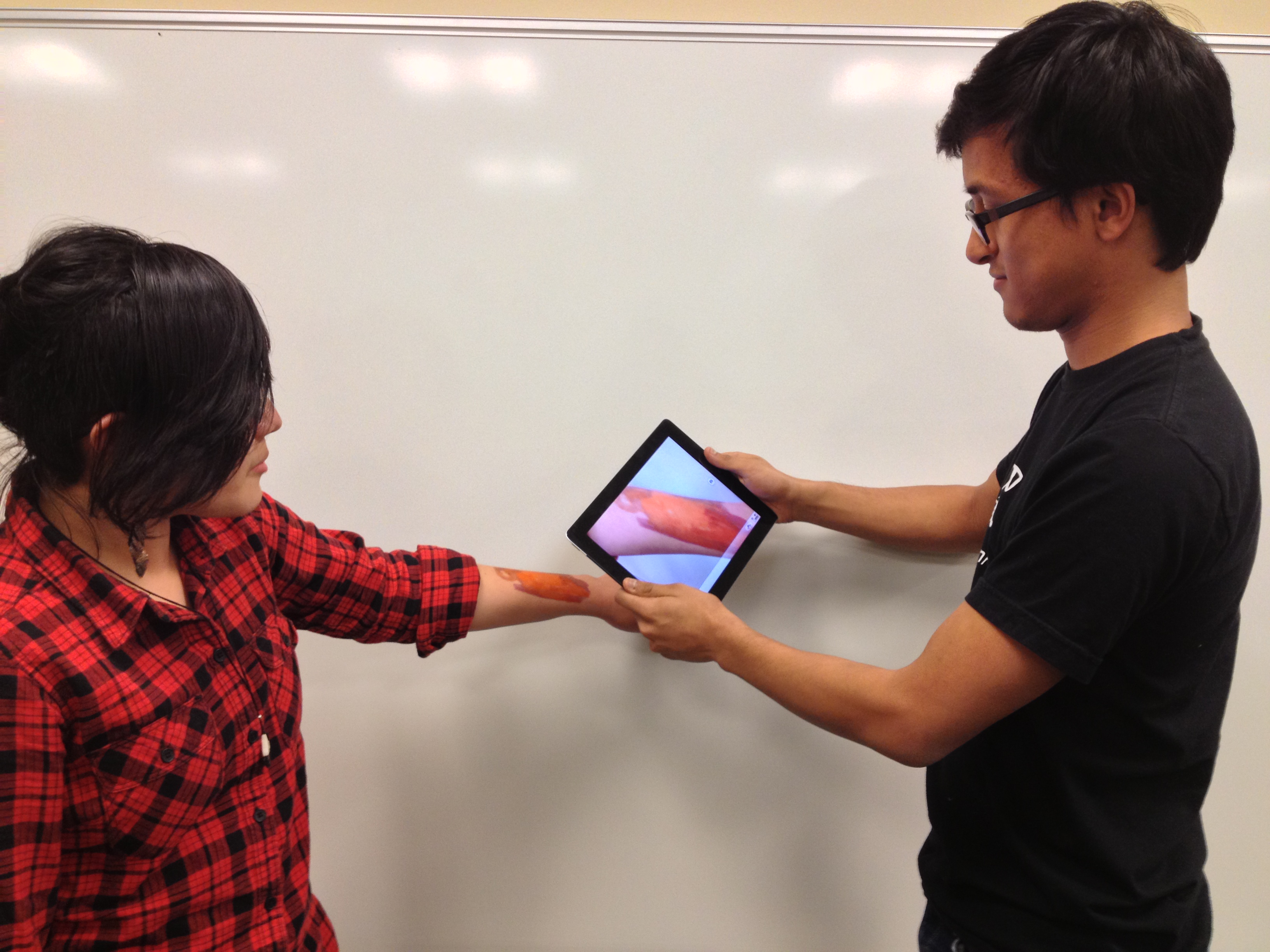
Our prototype made use of the iPad's built-in camera to simplify the process of tracking ulcers over time.
Observations
We first spent a few months interviewing and shadowing physicians, researchers, and nursing staff at local hospitals and nursing homes.
We needed to identify problems in existing work flows and get get a clear understanding of the constraints of working in a hospital enviornment.
Handoff sheets are critical.
Numerous individuals interact with a single patient. For nurses who took shifts, clipboard-ready handoff sheets were vital for staying on top of a patient's treatment and keeping in sync.
Groups of nurses develop their own shorthand.
We noticed that groups of nurses who worked together on a hospital floor often developed their own shorthand and terminology, making it difficult for others to interpret their notes later on.
Photo Comparisons were Difficult.
Photos of ulcers were taken with a traditional digital camera, printed, and filed in a manilla envelope. Making comparisons between ulcers was difficult, especially since sorting photos by date was a challenge.

Unclear benefits of forms
Much of the process of treating a patient was spent filling out complex charts and goverment-mandated forms - many of which asked nurses to collect data they felt wasn't useful for treatment.
Periodic Treatments often relied on human memory
Some patients required frequent treatment on regular time intervals. To keep track of these times, some nurses resorted to utilizing mental tricks or writing themselves post-its.
Hostile Family Members
Several nurses noted difficulty communicating with families, who are often hostile to news about pressure ulcers formed in the hospital.
Prototyping
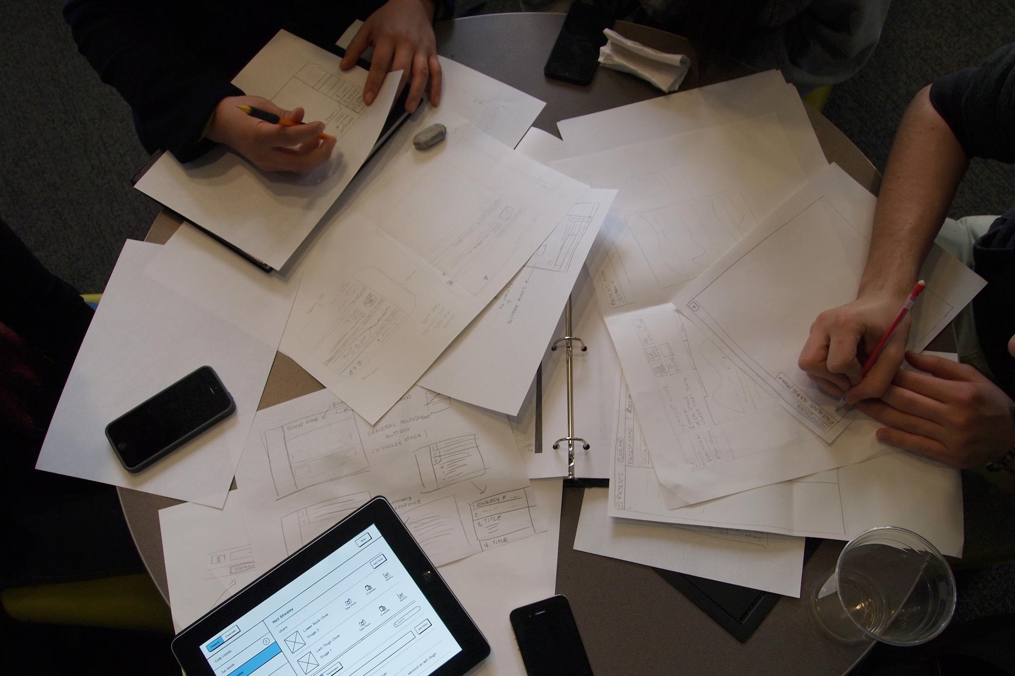
Once we had a clearer sense of what sort of functionality we wanted to include, we began rapidly prototyping and testing paper, Balsamiq, and HTML prototypes.
Using a Wizard of Oz technique, we tested our prototypes on a nearly weekly basis with a large pool of nurses at a local hospital.
We noticed early on that there was a relatively significant gap between younger and older nurses. Younger nurses who often owned personal tablets were far faster at navigating our prototypes.
Core Functionality
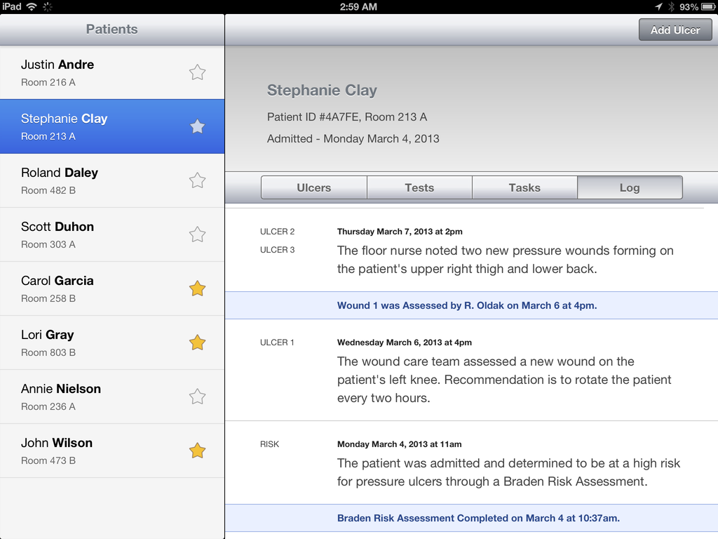
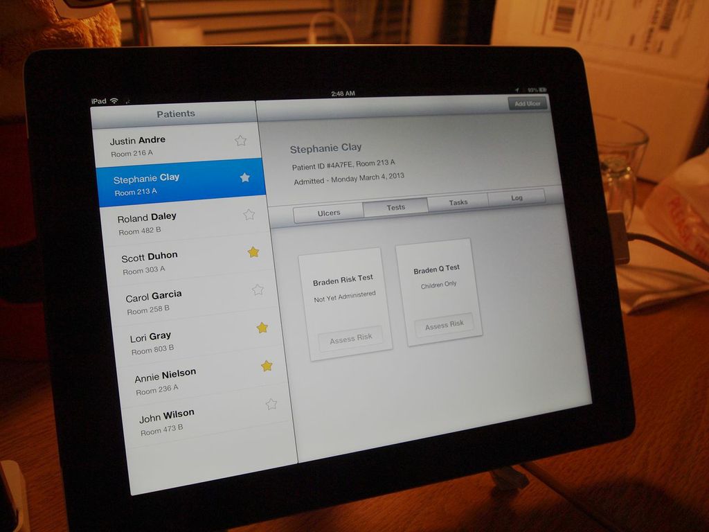
Our application ultimately came down to four key tabs.
Ulcers
A list of all noted ulcers for a patient, a way to capture photos and data about a specific ulcer, as well as a way to analyze a specific ulcer.
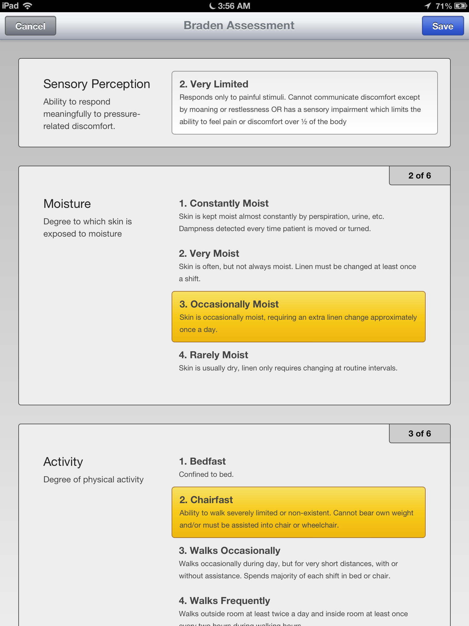
Tests
Nurses frequently had to administer a standardized set of tests, and log the results. We digitized some of their assessments so that the results could be easily analyzed later on.
Tasks
Treatment of a pressure ulcer often followed an unwritten checklist that varied little from patient to patient.
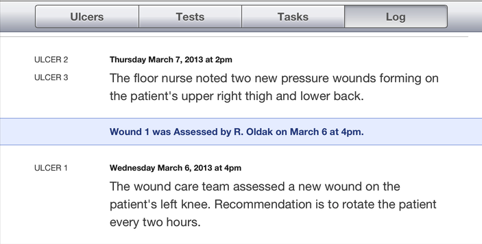
Log
Whenever a particular task was completed or a test was administered, we automatically logged the result in a patient specific feed to help larger teams communicate with each other.
I design and build interfaces, primarily for web and iOS.
In my spare time I also like to prototype new ways for people to interact with technology.
Get in touch - email me at ryhan@cmu.edu.
I`m currently a senior at Carnegie Mellon interested in the intersection between computer science and user interface design.
Previously I created interactive prototypes and wrote JavaScript at Apple, Google, and Metalab Design. I`m fond of CoffeeScript.
